The Store Is a System, Not a Floor Plan
Walking into a grocery store feels routine, but the space you're navigating has been engineered down to the shelf height. Supermarkets are among the most studied retail environments in the world, and their layouts reflect that research. The goal isn't just to help you find what you need — it's to maximize what you buy beyond your original intent.
The classic entry experience illustrates this immediately. Most stores open into produce or a floral section: fresh, colorful, and fragrant. This isn't accidental. Exposure to appealing sensory cues early in a shopping trip is associated with a more expansive, positive mood — and shoppers in that state tend to spend more overall. You haven't even reached the bread aisle yet.
Understanding the store as a designed system — rather than a neutral space — is the foundation for shopping more deliberately. For a deeper look at how this extends beyond grocery stores, see how retailers design stores to influence what you spend.
~60%
Grocery purchases that are unplanned
Various consumer behavior studies over the years have found that a significant majority of supermarket purchases are decided in-store rather than planned in advance.
3–5×
Higher sales rate for end-cap vs. mid-aisle placement
Retail merchandising research consistently shows end-cap displays generate substantially more sales volume than the same products placed mid-aisle, even without price promotions.
15–20%
Average overspend vs. intended grocery budget
Consumer surveys and financial planning research suggest shoppers routinely exceed their planned grocery budget, with layout-driven impulse additions being a primary contributor.
The Perimeter-and-Destination Trap
Most grocery stores are organized around a perimeter of fresh departments — produce, deli, bakery, dairy — with packaged goods filling the center aisles. The perimeter feels healthy and abundant, which is why many nutrition-conscious shoppers are told to "shop the perimeter." But retailers know this too, and the perimeter is designed to pull you through the entire store.
Dairy — one of the most universally purchased categories — is almost always at the far corner of the store. Getting there means passing the deli counter, a baked goods section, and several aisle openings. Each of those is an opportunity for an unplanned item to end up in your cart. This is called a destination item strategy: high-frequency staples are placed to maximize your store exposure on the way to them.
The same logic applies to store-within-a-store formats, where pharmacies, prepared food sections, and seasonal displays are positioned to interrupt natural traffic patterns and create additional browsing moments.
Map Your Route Before You Enter
Before grabbing a cart, take 30 seconds to mentally (or literally) map the sections you need to visit. Enter with a sequence in mind rather than following the store's natural traffic flow. This small step reduces the number of unplanned sections you'll wander through and limits your exposure to high-impulse zones like end-caps and promotional displays.
End-Caps, Eye Level, and the Checkout Lane
Three zones in any supermarket account for a disproportionate share of impulse purchases: end-cap displays, eye-level shelving, and the checkout lane.
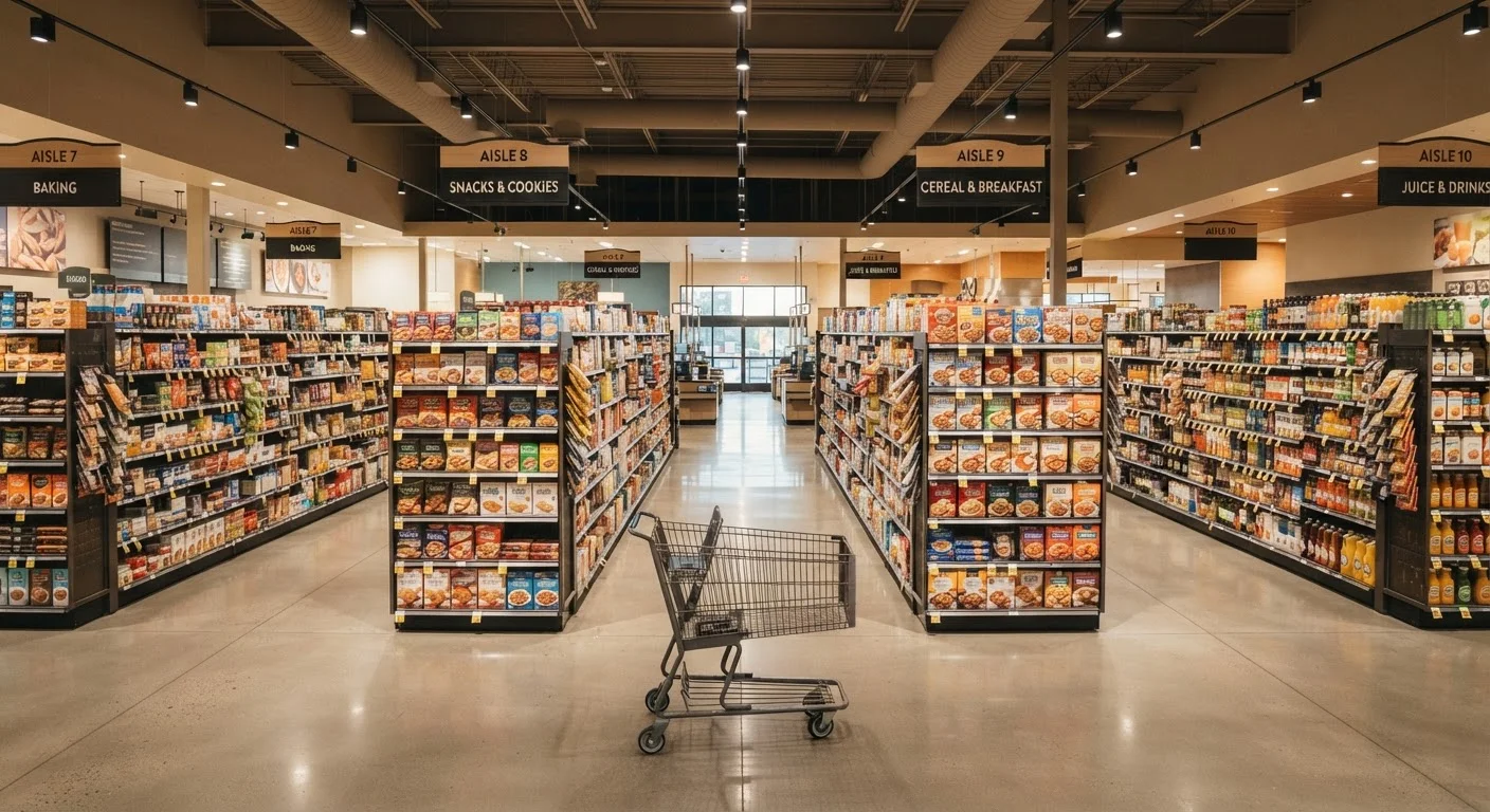
End-caps — the product faces at the end of each aisle — get far more visual attention than mid-aisle placements. Shoppers rounding a corner naturally glance at them, and retailers rotate high-margin or promotional items into these spots. The presence of a sale tag on an end-cap doesn't always mean the price is genuinely lower; the placement itself creates a perception of value.
Eye-level shelving (roughly between waist and shoulder height) is considered premium real estate. National brands often pay for this placement. If you're evaluating price per unit or looking for store-brand alternatives, you'll typically find them on lower shelves — which requires a bit more deliberate effort but is often worth it.
Checkout lanes are the last conversion opportunity. Small, low-cost, and often branded items fill this zone specifically because the barrier to adding one more thing to your cart is low when you're already committed to checking out.
These patterns connect directly to why your cart keeps getting more expensive — layout design is one of several quiet forces that add up over time.
Shopping With Intention: Practical Adjustments
Awareness of layout tactics is useful, but it doesn't automatically change behavior — especially under time pressure or decision fatigue. A few structural habits are more reliable than willpower in the moment.
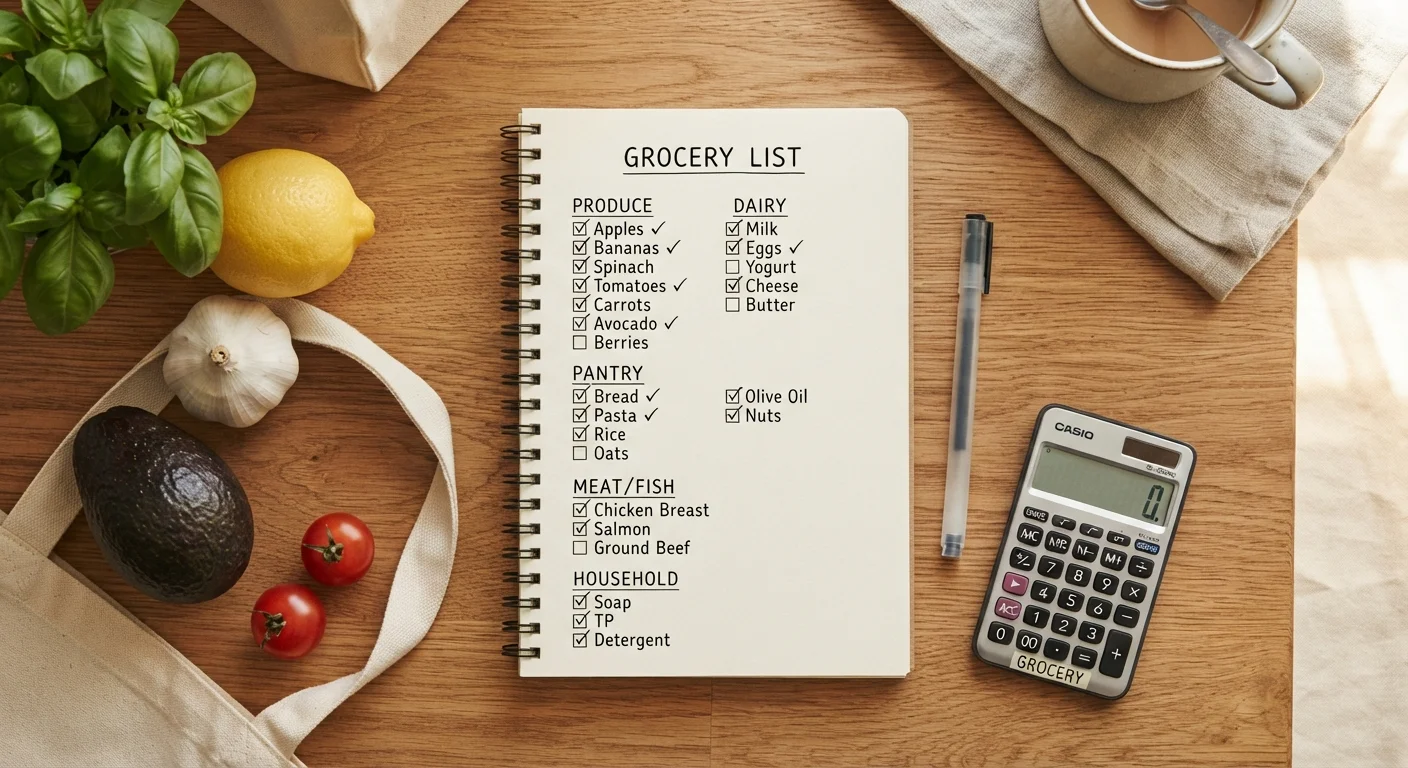
- Build a list organized by store section. Grouping items by department means fewer unnecessary detours. A well-structured shopping list does more than prevent forgotten items — it gives you a defined path through the store.
- Do a home audit before you go. Knowing exactly what you already have removes the ambiguity that often leads to duplicate or unnecessary purchases. See the pre-shopping home audit for a practical checklist.
- Use a smaller cart or basket when appropriate. If you're on a focused, limited trip, a hand basket removes the visual cue of an "empty" large cart.
- Pause at end-caps. Before adding an item from an end-cap or promotional display, check whether it was on your list and whether the price is actually better than the shelf alternative.
None of these require dramatic lifestyle changes. They're small friction points that shift decision-making away from the store's engineered environment and back toward your own priorities. For a broader pre-purchase framework, this pre-purchase checklist applies well beyond the grocery store.