Why Color Coordination Feels Harder Than It Is
For most of us, color confusion isn't about lacking taste — it's about lacking a framework. We stand in front of a closet full of things we like individually and freeze. Sound familiar? You're not alone, and it's not a personal failing. As explored in why outfits can look great individually but fall apart together, the issue is usually one of cohesion, not quality.
The good news: color coordination isn't a talent you're born with. It's a skill built on a handful of repeatable principles — most of which you can internalize in an afternoon and apply every morning without much thought.
Tone
Whether a color leans warm (reds, yellows, oranges) or cool (blues, greens, purples). Matching tones within an outfit creates visual cohesion.
Saturation
How vivid or muted a color appears. High-saturation colors are bold and bright; low-saturation colors are dusty or faded. Keeping saturation consistent across an outfit makes it feel intentional.
Value
The lightness or darkness of a color. Varying value — pairing a light piece with a darker one — adds contrast and definition to an outfit.
Neutral
Colors with little to no saturation — like black, white, grey, navy, cream, or camel — that pair easily with almost any other color and serve as reliable outfit anchors.
Complementary colors
Colors that sit opposite each other on the color wheel, such as blue and orange or red and green. When used in the right proportions, they create a balanced, high-contrast pairing.
Tone-on-tone
Layering different shades or values within the same color family — for example, light blue, medium blue, and navy — for a cohesive, depth-rich look.
The Only Color Concepts You Actually Need
You can skip color theory class. These three concepts do the heavy lifting for everyday dressing:
- Tone (warm vs. cool): Colors lean warm (yellows, oranges, reds) or cool (blues, greens, purples). Outfits tend to feel more cohesive when colors share a temperature — warm with warm, cool with cool. Mixing is absolutely possible, but keeping one temperature dominant helps.
- Saturation: This is how vivid or muted a color is. A dusty sage and a bright lime green are both green, but they don't pair the same way. Keeping saturation consistent across your outfit — all muted, or all vivid — creates visual harmony.
- Value (light vs. dark): Contrast in lightness is what makes outfits readable. A light top and dark bottoms create clear definition. Similar values top to bottom produce a softer, more blended look. Neither is wrong — both are intentional choices.
These three levers — tone, saturation, and value — explain why some color combinations feel instantly right and others don't. Once you can name what's off, you can fix it.
Use Your Phone as a Quick Check
Before leaving the house, take a photo of your outfit in natural light. Seeing it as a flat image — rather than in 3D on your body — makes color imbalances and clashes much easier to spot. It's a simple habit that builds your color eye surprisingly fast.
Three Reliable Formulas for Everyday Outfits
Rather than reinventing the wheel each morning, lean on proven combinations:
- Neutral base + one accent color: Start with a neutral (navy, white, grey, camel, black) and introduce a single accent color through one piece or accessory. This is the most forgiving formula — the neutral absorbs almost any accent you throw at it.
- Tone-on-tone: Layer different shades of the same color family. Think dusty rose, blush, and burgundy together, or cream, tan, and chocolate brown. The key is varying the value (light to dark) so the look has depth, not flatness.
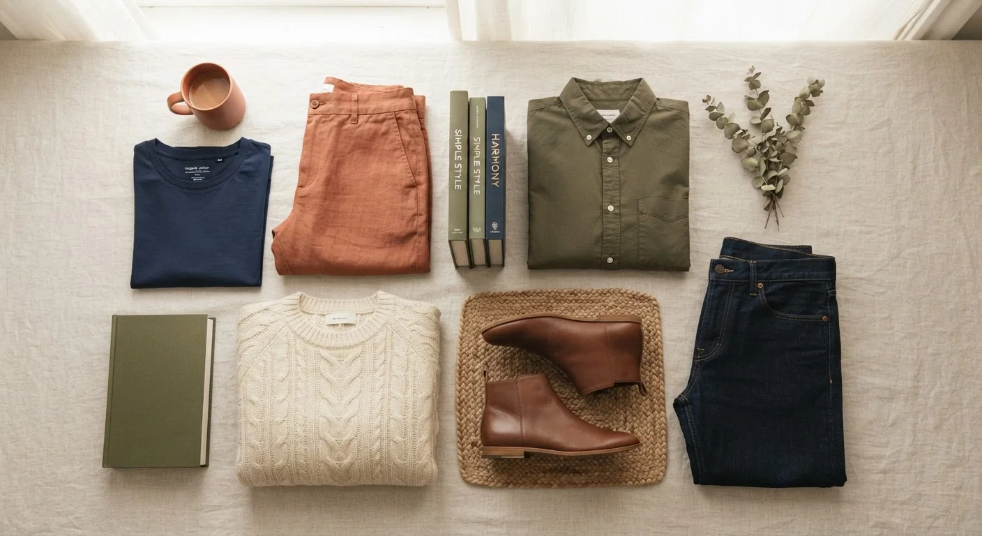
- Complementary contrast: Colors that sit opposite each other on the color wheel — like rust orange and denim blue, or olive and burgundy — create a vibrant but balanced pairing. This is bolder, but keeps the two-color rule contained so it doesn't read as too loud.
For a broader look at how color fits into the bigger styling picture, see how fit, fabric, and color each contribute to a polished outfit. Spoiler: all three matter, but each has its moment.
Common Mistakes and How to Sidestep Them
Even with good instincts, a few habits tend to derail color coordination:
- Ignoring undertones in neutrals: Not all neutrals are interchangeable. A cool-toned white clashes with a warm-toned cream. Hold pieces next to each other before assuming they match.
- Mixing saturations without intent: Pairing a washed-out, faded piece with something vibrantly saturated creates a disconnect that's hard to pinpoint but easy to feel. Try to keep the energy level consistent.
- Over-matching: Identical top-to-bottom color can look flat rather than intentional. Vary the shade slightly — a lighter and darker version of the same hue reads as deliberate.
- Adding too many accent colors: Each additional color competes for attention. If you have a patterned piece already carrying multiple colors, treat it as the color statement and keep everything else neutral.
Patterns Already Carry Color — Account for Them
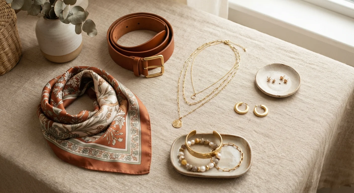
If you're wearing a patterned piece, pull out one of the colors from that pattern to repeat elsewhere in the outfit rather than introducing a new one. Adding a fourth color on top of a busy print almost always tips the look into visual overload.
Once you feel comfortable with solid-color coordination, you might enjoy exploring the logic behind pattern mixing — the same core principles apply, just with more moving pieces.
Building a Color-Friendly Wardrobe Over Time
The easiest color coordination happens before you even get dressed — it happens at the point of purchase. When your wardrobe shares a loose color story, almost everything works together without effort.
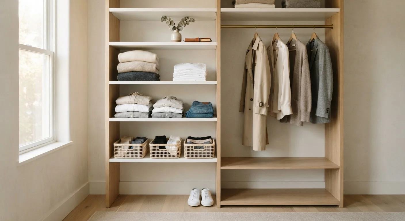
A practical approach: identify two or three neutrals that anchor your wardrobe, then choose one or two accent color families you're genuinely drawn to. Over time, direct most purchases toward that palette. You don't need a rigid capsule wardrobe philosophy to benefit from this — just a little more intentionality at the point of decision.
For a full picture of how color fits into everyday styling from head to toe, this complete starting point for building your look covers the whole picture, including occasion dressing and wardrobe maintenance.
Color confidence isn't about getting it perfect. It's about developing a feel for what works and trusting that feel a little more each time you get dressed.