Why Color Coordination Feels Harder Than It Is
Most people learned about color by being handed a wheel in art class and told to memorize it. That framing makes coordination feel like a test you could fail — and a lot of us carry that anxiety straight into our closets. The truth is that coordinating colors in clothing is far more forgiving than matching paint swatches or interior design palettes.
Fabric, texture, and lighting all soften the relationships between colors in a way that flat color samples never do. A shade that clashes in theory can work beautifully in practice when one piece is matte and the other has a slight sheen, or when the tones are desaturated enough to feel calm side by side. Understanding this takes some pressure off. You're not trying to achieve mathematical precision — you're building a visual impression that reads as cohesive.
Color is just one element of what makes an outfit land, so when in doubt, prioritizing fit and fabric can compensate for imperfect color choices more than most people realize.
62%
Americans who find getting dressed stressful
A survey by OnePoll found that a majority of Americans experience some form of outfit decision fatigue on a regular basis.
3–5
Core color relationships used in most outfits
Style educators generally note that a small handful of color pairing principles — neutrals, analogous, and contrast — account for the vast majority of well-coordinated everyday looks.
The Three Relationships That Do Most of the Work
You don't need to know every color pairing that exists — just the three that account for most successful outfits.
Neutrals as a Foundation
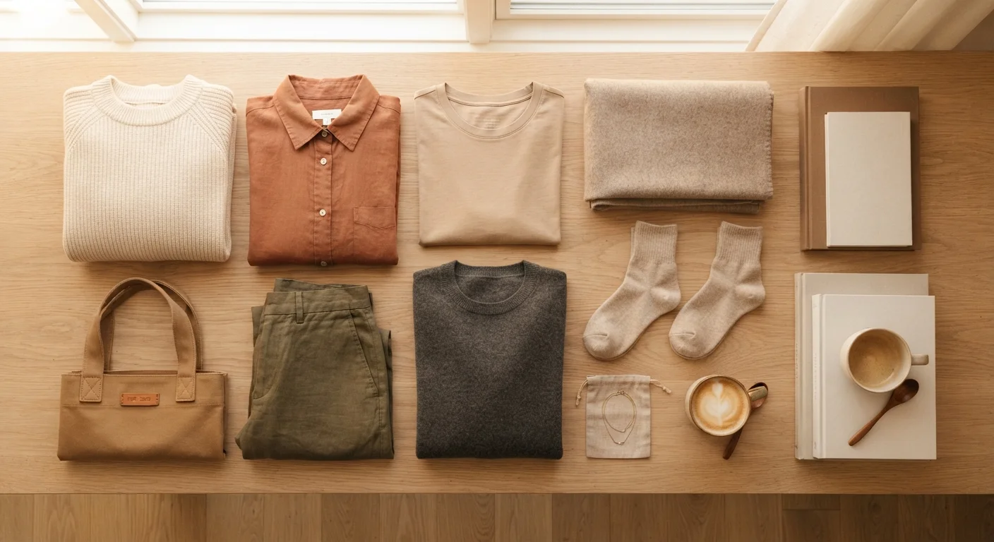
Black, white, gray, navy, camel, and tan are called neutrals because they carry almost no color tension. They recede visually and let other pieces lead. A wardrobe built around a few reliable neutrals means you can introduce any color on top without worrying about a clash. This is the foundation of the effortless capsule wardrobe concept, and it works precisely because it removes complexity rather than adding it.
Analogous Pairings
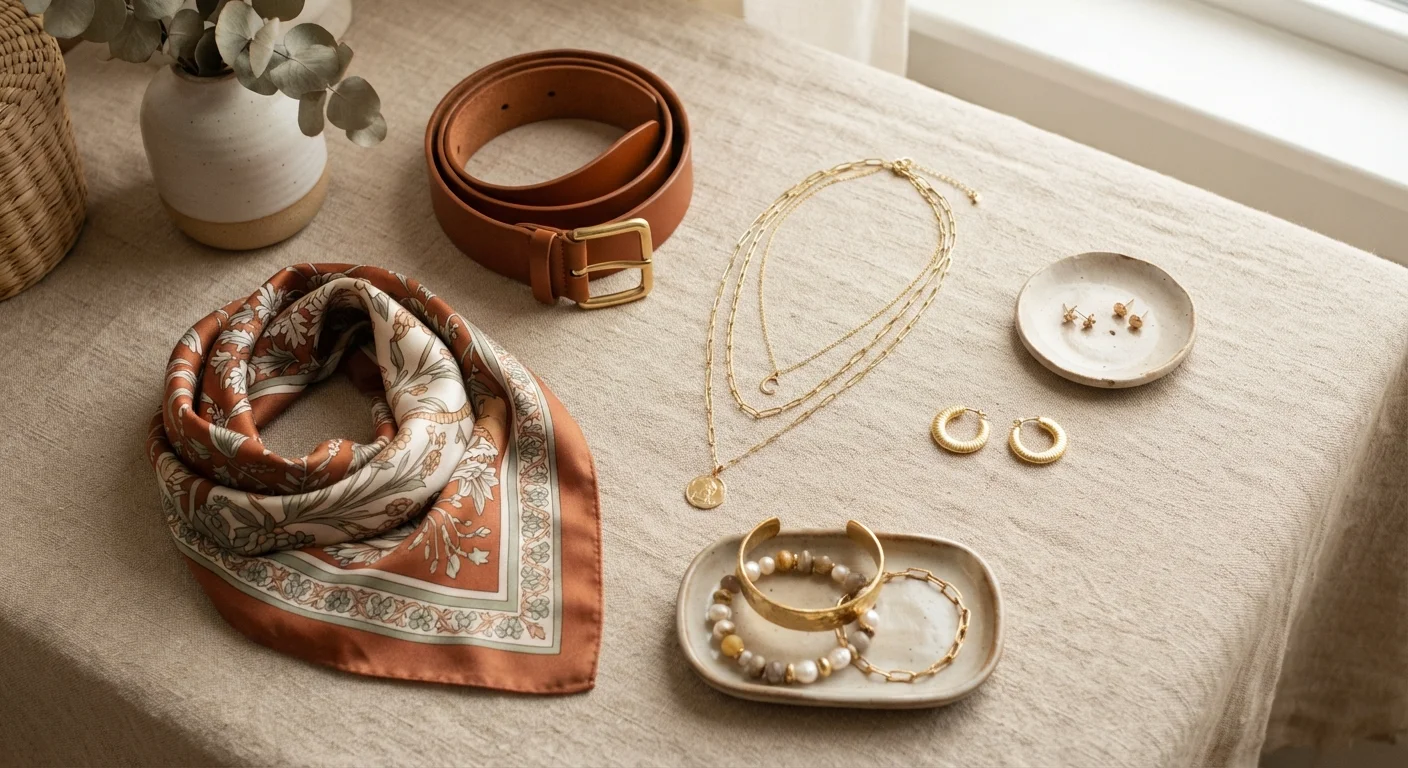
Analogous colors are those that live next to each other in the color spectrum — blue and green, orange and yellow, pink and purple. Because they share undertones, they naturally sit well together. Wearing rust with olive, or dusty rose with mauve, creates an outfit that feels thoughtfully composed without requiring any deliberate calculation. It's the approach behind most tonal and earth-tone outfits that look polished with minimal effort.
Light-Dark Contrast
Even when two colors don't have an obvious relationship, pairing a lighter version of one with a darker version of the other creates enough visual separation to make an outfit readable. Pale sage with deep burgundy, soft cream with charcoal — these work not because of hue theory but because the value contrast (the difference in lightness) gives each piece its own visual space.
Try Tonal Dressing as a Starting Point
If color coordination still feels uncertain, tonal dressing is the most forgiving place to start. Pick one color and wear two or three different shades of it together — a light camel top with deeper brown trousers, for instance. Because everything shares the same color DNA, the look almost always holds together, and it teaches your eye to see subtle shade differences rather than treating color as binary.
Practical Strategies for Everyday Dressing
Knowing the principles is one thing; applying them on a Tuesday morning is another. A few habits make the process nearly automatic.
Anchor with one neutral piece. If you're uncertain, start with a neutral item — a white shirt, dark jeans, tan trousers — and build from there. Almost any second color you reach for will work against that anchor.
Use the 'one pop' rule. Reserve bold or bright colors for a single piece per outfit. When one item is the clear statement, everything else serves it rather than competing with it. This approach works especially well if you're just starting to experiment with color.
Pull from a pattern. If one of your pieces has a print, look at the colors already inside it. Matching a solid to any of those colors creates instant cohesion — the print itself becomes the visual bridge between what might otherwise feel like unrelated pieces. See how this idea extends into pattern mixing more broadly once you're comfortable with the basics.
Repeat outfits strategically. Once you find a color combination that works, don't abandon it. Outfit repeating is a legitimate and practical strategy — you can refresh the look with different shoes or a layering piece without reinventing the color combination from scratch.
When Colors Don't Cooperate
Even with solid principles, some combinations just won't click. When that happens, the most common culprits are undertone mismatches — warm and cool versions of the same color fighting each other — or too many saturated colors competing at once.
The fix is usually simpler than it seems: swap one piece for a neutral, shift one item to a lighter or darker version of the same hue, or let one color visually dominate while the other plays a supporting role. When individual pieces you love don't combine well, the issue is often about these small adjustments rather than anything being wrong with the pieces themselves.
“Color confidence isn't about knowing the rules — it's about training your eye to notice what feels balanced and what feels noisy. Most people already have better instincts than they give themselves credit for.”
— Tim Gunn, Fashion educator and author
This article is for general informational and style guidance purposes only. Fashion choices are personal, and what works best will vary by individual preference and context.